
Website Design
Conventions of Websites
Research on Existing Websites
This unit was about designing my website in order to effectively promote myself with it and to appeal to the target audience. I did both secondary and primary research in order to find out what should be in a personal website and what components make it more effective and to then apply that to my own website.
What People Look For in a Website
Summary of Previous Research
Flat Plans
Website Pitch Deck
Reflection Logs of The Making of The Website
Website Evaluation
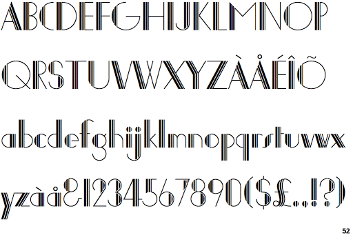
For the design of my website, I used my own photos that I have taken for the backgrounds of pages. I believe I have managed to subvert expectations of portfolio websites like this one by, for example including the Menu at the bottom of the page. I think this is particularly effective in the home page where the viewer can see the 'Contact' page button after seeing my Showreel, instead of having to scroll back up to find it. so I think although this isn't typical for websites, I think this less monotonous website design helps to reflect my personality well. Also, for the writing font, I used the 'Joanna Solotype' font that I originally saw on Lana Del Rey's album 'Honeymoon', which is an album I really like and I felt that it would fit in well with the website's aesthetic.


I had you in... in my head. Are you real? Are you real? Is there any chance that I'm just gonna wake up on the floor and this won't exist?
If I wake up and this doesn't exist... and I don't exist...
If I'm here making this website right now and you're here reading this sometime in the future... Is any of this real?
(I think I made this up inside my head)


